Home

GoMore Product design

The spice
of life

Skills used

GoMore is a global car sharing company based in Denmark. We're a surprisingly small product team. Given that, I've enjoyed working on many projects from tiny tweaks and improvements to researching, testing and building brand new features. One product designer (me), two app devs, one frontend dev, four backend devs, and one product manager

It's a date

Some people are on time, others are out of time, and everybody thinks about time differently. For example, Americans write dates incorrectly, but that's OK. When it comes to interfaces, time is something we all fear misreading, often needing to double or triple check.

Standardisation of date and time formats
An instruction manual we created for dates and times

I worked closely with our App lead establishing standards across six languages for how we display dates and times on the website and app. Chipping away at the dozens of different ways we were showing them. I focussed on making things as human as possible — no robots allowed! I scrutinised each detail right down to the en dash.

For example:

02/12/20 at 10:30:00 - 02/12/20 at 19:00:00”

became

Tue, 2 Dec, 10:30 – 19:00”

Much better.

Our previous date picker on car profiles was hard work. The renter selected the dates that they wanted to rent a car and only then found out if it was available or not (through error messages). At the bottom of the page, there was also a complicated visualisation of the car's availability.

An unhelpful error message A complicated visualisation of unavailability
How it used to be: An error message, and a tough to understand calendar
This is Whac-A-Mole! There must be an easier way...”—I thought
to myself

Well — there was a better way, but it wasn't easy. We set ourselves the lofty goal of eventually incorporating the concept of availability, and we wanted to prevent people from being able to make impossible selections, removing our reliance on error messages. My brain began to sizzle gently with questions like, “What's the difference between 00:00 and 24:00?” "Technically 24:00 doesn't exist, but it's a useful way of communicating the end, rather than the beginning of a day

A complicated visualisation of unavailability
Documenting the user journey

Time. Time to research best practices and competitors. Time to iterate. Time to build a prototype. Time to test that prototype with my girlfriend over the breakfast table. Time to test it with the general public. Time to withstand the scrutiny of the harshest critics of them all; backend developers.

The second iteration, on our website

Our first iteration prioritised reducing the number of clicks/taps. It was built to be fast and made assumptions, prioritising what data informed us were the most common booking patterns. The second iteration walks the user through each required step; it may feel slower but results in less confusion.

GoMore's date and time picker on apps GoMore's date and time picker on apps
The second iteration incorporates the complex notion of availability

I feel proud of the work we put into this, and at the same time, I know that the solution doesn't work for everybody. There's plenty more that can be done, particularly around explaining why some days are unavailable and cannot be selected. But I'll save that for another time.

Avoiding putting lipstick on a pig

Updating our native apps began as a bit of rouge and eyeliner, but developed into full-scale reconstructive surgery. The complexity of showing one UI for two very different products (ridesharing and rental) had long been an obstacle to a straightforward user experience. We decided to split the app into two modes; ridesharing and rental.

The previous design of the GoMore app The new design of the GoMore app
Educating users about where ridesharing has gone

Another (easy) decision was to remove the home tab, which had become bloated with marketing messages and product suggestions. Instead, renters begin on the search tab; with one prominent area for marketing, and owners start on the "rentals" tab; where they can easily manage their bookings.

The previous design of the GoMore app The new design of the GoMore app
Users were greeted with an overwhelming list of things we wanted them to do

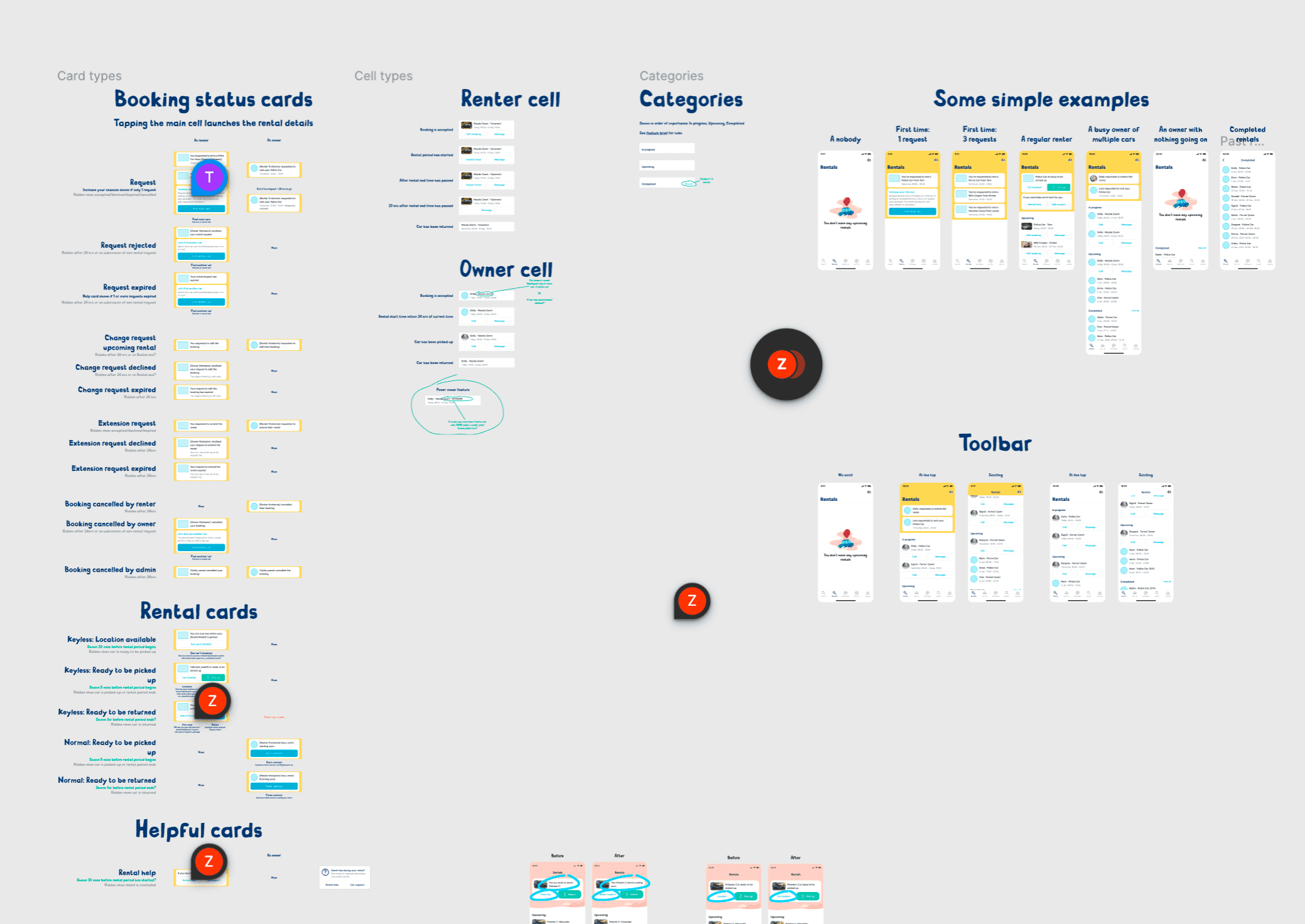
Our new rentals tab became the place for users to manage their bookings. We created a dynamic design that draws attention to anything that requires immediate attention or is unresolved, providing the relevant actions when you need them the most.

Exploration of rentals tab Rentals tab on GoMore's app

Throughout the process, we collaborated closely with our customer care team, and our commercial team. We identified pain points in the current rental experience and sense-checked all of our proposals.

The devil is in the details

GoMore's date and time picker on apps GoMore's date and time picker on apps
A visual upgrade as well as a functional overhaul of car profiles

We studied the text that car owners had written and overhauled the structure of these pages, making them simple and easily digestible (like bananas). We focussed particularly on trust and reassurance, addressing common anxieties people may have before renting.

An illustrated repeating pattern An illustrated repeating pattern
Reassurances about insurance and the cancellation policy have been surfaced nice and close to the booking button

Boo!

65% of first-time renters hadn't uploaded profile pictures, which meant many owners felt uncomfortable trusting these people with their cars. Introducing the following prompt resulted in a 45% reduction of "ghosts" on the platform and a positive impact on rejection rates too.

Anton is afraid of ghosts
In user testing sessions, people didn't only notice the prompt; they did what it asked